Wednesday, May 5, 2010

3 ads that "come together"


I absolutely love this commercial for Kindle. It is my favorite commercial on TV at this time. I love all of the different motions and textures that are created. I think it's very innovative that a lot of the background is made out of fabrics and clothing that all come together to form great scenery.


This ad is a little similar to the Kindle commercial. I think they are both stop-motion produced. My favorite part about this one is when she's in the ocean and little kids clothing items float around her like fish. There are a lot of actions which keep this ad exciting. I admired all the vivacious colors that created a happy vibe. It's almost whimsical because she starts off sleeping, her furniture fades away and she dives in to this different world, and then comes back to her bedroom and the furniture reappears. I love this interpretation of a dream and feel like it captures the dream aspect very well.


This ad was done by BBDO Argentina. I love the imagery created by the neon runners sprinting around building and trying to beat eachother. This ad was done in order to get people to run a 10k in Argentina sponsored by Nike. I found out that the people were actually made of neon sticky/post-it type notes, which is really amazing.

3 ads that are socially responsible and 3 that are not

In today's world, the average person views hundreds of ads daily, whether we want to or not. Some ads are for the greater good of society, while others are controversial and are believed to deteriorate the morality of our culture.

3 ads that I think are socially responsible include:

#1:
I believe this ad to be socially responsible because it announces the issue of beauty in our society and how the ideal beauty is superficial in our culture. It delivers a great message for mothers to recognize this issue and talk to their daughters. This is one of my favorite campaigns.

#2:


I think this commercial by truth is socially responsible because it puts the massive number of deaths due to cigarettes in to perspective. Cigarette smoking is one of the leading causes of cancer and death globally, and big tobacco companies know this and still gain new customers every day. Truth was responsible to confront the tobacco company and ask them if this is what they're proud of.

#3
Thousands of children are physically and sexually abused every day. This ad conveys the fear and anxiety that children who are abused get, and it is saddening. This is a great campaign designed to reflect the reality of child abuse and try to stop it.


Many ads are socially irresponsible because they are either vulgar, tasteless, inappropriate for children to see, racist, prejudice to women, or just demeaning to society as a whole. 3 examples of these types of ads include:
#1
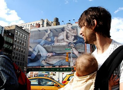


This racy Calvin Klein ad was placed in the middle of SoHo, which reachs millions of ages groups. This is socially irresponsible because lots of children see this ad outdoors. It may be one thing if this were featured in Maxim, GQ, Cosmo, or a more adult segment media. This is horrible to be in public because younger teens and children think this is "hip" or "cool".

#2

The message of this ad is not horrible, but the symbolism is. This ad appears racist because there is a white corporate manager and 6 black athletes surrounding him, almost as if bowing down subserviently. The white male stands tall and confident, while the black mans bow down to him. This is also suggestive that the white man is cable of having this corporate position, while the black males are important for there physical attributes. Why couldn't the corporate man also be white like the athletes? Why couldn't the athletes be white? It almost seems a little too stereotypical, and I think this was a very poor layout choice for Intel.

#3

This ad is disgusting because it objectifies women. The older model of the camera is represented by a flat-chested, less curvy woman. While the newer, more enhanced version is represented as a busty woman who has more sex appeal. This ad is suggesting that a better version of a woman is also a more enhanced woman. This is bad for young girls to see because then they too think this is how you are supposed to look and it makes them self conscious.

3 Artful Advertisements

I think some advertising is artful. Not all advertising is artful, but it would be ideal if society could have all advertising as art. To me, advertising is art when it is tasteful, aesthetically pleasing, boasts elements of design, and provokes an emotion or thought. Also, am advertisement is artful when it is original and stands out. Granted, advertising does not have to be all of these things to be art, but usually it is a combination. 3 ads that I think are very artful are
#1:


I think this ad can be considered art because it is original and unlike anything ever done. I also think it is art because it possesses intertextuality between the new technology that Apple created and the novel 1984 by George Orwell. It is thought provoking because it makes people wonder what they are releasing, and it also provokes people to think if society could ever turn in to this. It was very unique to the time because it came out in 1984.

#2

I love this commercial, along with the entire Sony Bravia campaign done by Fallon. It is so creative and captures the essence of color. The music captures the movement of the balls and gives up a sense of calmness while these balls are falling all over the city.


#3

I wanted to show an outdoor ad that can be artful and I chose this Nike soccer ad done by Wieden + Kennedy. It is amazing how much it appears like the soccer ball is crashing in to the building. This is art because it is unique and although it may not demonstrate beauty, it captures force and motion.


Sunday, May 2, 2010

22squared Tampa: "Moving" Pods Commercial


I really liked this PODs commercial a lot because it was very artistic and also funny. I feel like the term "reinventing" is really represented in this commercial because things are altering, shifting, and changing very rapidly throughout the advertisement. This also shows how PODs is great with people who move a lot, or reinvent their lives with different jobs in different places or whatever provokes them to move. Visually, this ad reminded me of paper dolls, or more 2-dimensional. I'm not sure if the creative process was done through picture frames or not, but that is sort of what it seems like. This ad also demonstrates how PODs is easier than doing it yourself. This is especially proved in the part where the man tries to move the fridge up the ramp and fails, but with PODs one can just move things quickly on the ground. I thought it was funny how he created an ice sculpture with a chain small for his wife while they were waiting on the PODs truck to come pick up their POD, but I guess this just retouches on how you will have more time on your hands when you choose PODs.

Venables, Bell & Partners, SF: "Horse head" Audi Commercial


I found this ad some what humorous because it had intertextuality that related to the Godfather (not the movie, the novel). I really like how this ad has more of a popular culture story line and is extremely different from any other car commercial. I think it's funny that instead of an actual horse head with blood in his bed, there is an chopped old luxurious car with motor oil every where. I think Venables, Bell & Partners also was trying to deliver the message with this classic movie/novel that there is a new kind of luxury in town. When the scene switches from the man's bedroom to outside, you see this beautifully bad Audi out front that switches its lights on. VB&P almost personifies the car as being the culprit, or the bad guy, which definitely gives it a sleek and dangerous vibe.

Taxi: Mini Cooper Outdoor Ad


I think this outdoor ad done by Taxi for Mini is very attention grabbing. I like how the outdoor ad creates an action and provides a nice visual image. It appears the Mini is about to be sling shot across the highway. The white text of black background keeps the message neutralized, and allows for the red Mini to stand out. The red border along the billboard also allows for emphasis on the Mini. Since this is a Canadian agency, the message is in French, obviously. I tried to translate "agrippez-vous" and what I got was "grip", so I wasn't quite sure what it means. Maybe it means that the Mini has good grip on the road? I'm not positive. Anyways, I thought this ad was a great outdoor ad and provides for something more though-provocking than just a picture of a car winding down a road

Jung Von Matt: "Mercedes SLS AMG" German Commercial


I found this advertisement on Jung Von Matt's website. The entire site was in German, so it was a little hard to make out if this was a mini film clip or commercial that ran in Europe. I also was not sure if the SLS AMG really made it upside down in the tunnel or if it was edited, but a lot of websites such as youtube.com had posts saying that it really did happen. Whether it did or didn't happen, I though the film approach was really impressive. There was this intense vibe about it that builds adrenal in anticipation for what is about to happen. Everything seems to be in slow motion at first, but speeds up the minute the driver gets in the car. This builds up to the climax when he races upside and loops through the tunnel. I'm really amazed how a film crew captured this, because the viewer is able to feel as if they are in the moment.

David & Goliath Santa Monica: "Kia Pins" Commercial


This ad appealed to me because it emphasizes the outdoors, road trips, and creating your own path. The analogy of your car being your pin to the map is interesting because a car is a vehicle in which you travel and get from city to city. I loved the imagery of the red pin on top of every car and places that the cars travel through. This commercial captured the vast western United States, which symbolizes freedom and open spaces. This also retouches on the creating your own path message because this part of the country is great for traveling and road tripping. I also think a lot of young families just starting out would be in the target market for this car, and I feel as if it is also saying this is a car you can build memories with, which is important for a young family.

AMV/BBDO: "Footprints- Act on CO2" UK Gov Ad


This advertisement was very moving and had a great public message. Everyone knows that we need to lower our carbon footprints, and instead of trying to provoke fear, AMV/BBDO captured this issue in a way that was thought provoking, at least for me. This ad made me think, "oh, do I really do that a lot?" or "yeah, I could probably do that less". The repetition of the little black footprints made me realize that one person really can have a lot of issues they need to fix, and when you multiple that times a couple billion it is scary to think about. Again, it is a scary thought, but I think it was more effective that AMV/BBDO didn't show a clip of the apocalypse or a bunch of natural disasters. Also, the black gooeyness of the footprints reminded me of pollution or uncleanliness, which reiterates the fact that we are polluting and taking advantage of our Earth.

72 and Sunny: "Chelsea Lately" Website


Chelsea Lately is one of the only nightly shows I watch on television. I see a lot of Chelsea, so I feel like I am a good person to say if this website is up to par with the show. I definitely liked it and I feel like it flows very nicely with her style and branded show. The color scheme on the website is very similar to that of the show, and I like how 72 and Sunny incorporated a lot of key elements from her show, such as the character Chewy, into the website as well. Chewy ads a lot of comic relief to the show and people LOVE when the run little mini films with him on the program, so I think it is cool that a Chewy podcast was incorporated into the site. I noticed there was a ringtones portion, and I feel like this is very important for the target audience that would visit this site. I imagine the target audience are young women age 18-24 who are hip in to fashion, music, and celebrity gossip, and I think 72 and Sunny made this website very appealing to that segment.

La Comunidad: "Give Me an M" MTV short film/commercial


This commercial really fits the brand image of MTV because they are always doing something way different that people don't always understand. This commercial done by La Comunidad is very memorable to me because of its quirkiness and the fact that it is almost like a mini movie. Since the 1980s, MTV has been personified as young and rebellious, and this is exactly what this boy is doing because he does not want to conform his "M" to Chemico. I liked the consistency of the green color hue throughout the film as well. I feel like it was easier to follow what was going on because no other colors really stood out or took my attention off of the boy. M stands for MTV, obviously, but I also think they are subliminally giving a message of don't give up your own beliefs or who you are because of someone or something else. Maybe I am over reading it, but that was also my take on the commercial.

Mother New York: Gaga Monsterball print ads


I LOVE LADY GAGA and I thought this campaign done for Virgin Mobile's launch of the Lady Gaga Monster ball Tour was awesome. Part of this campaign was to promote Monster ball in print, online, and have fun activities and prizes at the concerts. Mother NYC's website stated some of the things they thought up was to have: "Virgin Angels in Gaga-esque attire lead fans into a Virgin Mobile area where they pose for professional photos that are posted each night at ladyvirgin.com". I think this particular print ad that I picked was for ladyvirgin.com. These are the people that are at the events and grab people to come take professional photos that are posted later that night. I love these pictures, especially the girl with the bubbles because Gaga has been known to pull some costumes like that to award shows and the like. I also like the contrast in stance and facial expression of the 3 people. They are apparently all mimicking Gaga style, but it's all very playful and fun. I also admired how the picture of each individual resembles a retro photo booth cut out, which fits the personae of Gaga very well. This ad made me want to go to Monsterball.

Droga5: "Lift" Puma Commercial


I was captivated by all elements of this ad from color to movement and rhythm and also to the music. I loved getting the impression that the people were caught up in all these moving scenarios, when really they were in a still room and the projector was moving. The commercial reminded me of an exhibit I saw at the MoMa a few years back. The neon colors were neat and resonated the image of Puma. I think of Puma as very hip/urban and colorful. My favorite part was when they go to the bedroom and act like the they're on the mattress with the twisted perspective, and also when the fireworks appear. It was very innovative of Droga5 to be able to create such a vivid storyline with no words in only 1 minute.

Cramer-Krasselt: "Feel the Love" Crocs print ad


This ad campaign reminds me, although very goofy looking, Crocs are extremely comfortable. I like this campaign and the imagery of little Crocs personified as rubbing peoples feet. Even though this is a little strange, it makes me want to put a pair on because it looks so nice to have a foot rub. In this ad, the Crocs are pink and stand out. There are minimal colors but a nice balance between the pink Crocs that massage and the logo of the Crocs, as well as the green natural background with the green yoga mat. The women provides a nice break in the page and is wearing a black outfit with her head down, so she does not take away from the attention on the shoes. Her long legs and stretching arms point to the Crocs, which is another aspect that makes them the focal point.

Doner US: "Traidor" Serta Commercial


I laugh out loud every time I watch this commercial. The sheep are just too funny. I like the concept of portraying sheep as mad for the new Serta mattress, because now people don't even have to count to get to sleep. This is my favorite commercial of this campaign because I love how one of the sheeps is a "traidor" and wants to try the mattress out. The voices of the sheep are also funny because they're gruff and sort of angry, which is not the way I would picture sheep if they could talk. I guess they're just bitter about the mattresses. I also think the way they are animated is very cool. They look like the Chicken Run characters, but I'm not sure if they were also modeled of clay like Chicken Run. Their clay-like appearance also makes them very cute, but it's funny that they don't sound cute. #1 is very bossy and the leader of the revolt against Serta, so I bet he kicked #86 out of the pack.