Friday, April 30, 2010

The Richards Group: "Water tower" Chick-fil-a Outdoor


Being from Georgia, Chick-fil-a has always been my fast food restaurant of choice. I adore their cow campaign and think it is so clever. Everything the cows do or say is always so funny. The idea of a cow for a spokesperson is hilarious, because they don't want to get killed. I loved this outdoor water tower ad that depicts 2 cows trying to paint "Eat more chickin" on the side of the tower, however, one fell off and the other one is holding on for life. This provides another layer of comedy to their usual campaign and gives by passers something to laugh about, and maybe even want to stop at the nearest Chick-fil-a

Wednesday, April 28, 2010

BBH New York: "Lego House" Commercial


The visuals of this commercial really stand out to me and I thought it was really cool how the film is fast forwarded. It almost makes it seem like the house has come to life. It's interesting that the foundations of the house are filmed 2-dimenstional, or flat, and as the house builds upwards, then the perspective changes. The vibrant colors of the legos stand out, keeping the focus on the product rather than the people. The red shirt of the little boy and the darker blue shirt of the Dad allow them to blend in as well. The message "build together" is very heart warming and sweet because it encourages parents to help their kids and be apart of there playtime. Also the building of the house is a good analogy for this message because a house represent a family, so in a sense they are strengthening their bond.

Wieden + Kennedy Portland: "Coca-Cola Avatar" Commercial


I love all of the Wieden + Kennedy coke ads. They make me wonder how much thought and effort actually goes in to making them because they have creatures and crawlers that I have never seen or thought about seeing before. Not only for this ad, but also the ad where there is a land of creatures living in the vending machine, the characters of the bus, as well as the bugs in the commercial where they try to steal the bottle of coke. I think it's interesting how people are portrayed as video game characters. I also think it's funny that the girl in the cafe was portrayed as a big oger, but once he meets her he realizes that things or people aren't always as they seem.

Dentsu" "Sumo Wrestler with Brad Pitt" Softbank Commercial


This ad was very funny and reminded me of how different the Japanese versus American cultures are. We have such differences in what is socially acceptable, normal, or funny. There was no doubt this ad was funny, but I feel like this ad was a little juvenile, which obviously appeals to an older crowd in Japan. I know they loved the fact that Brad Pitt was the assistant to the Sumo Wrestler, because I have heard that many Japanese people go crazy over famous American actors or singers. Our entertainment industry is the premiere in all of the world, so obviously various cultures are able to identify who Brad Pitt is. It's funny to me that Brad Pitt played the assistant to the Sumo Wrestler, because in reality he is much more famous. I'm not sure if this is poking fun at American culture or not, but I know Sumo Wrestlers are like celebrities in their culture, so it's almost like we are being made subservient to their culture. I like the message that Softbank will do ANYTHING for their client, even carry them if they break their shoe, and even if they do weigh 500 pounds.

Kirshenbaum Bond: "Accesories" Tab print ad


This Tab energy drink campaign is targeted to young women who need "fuel to be fabulous". I really like the way that Tab resonated female flare to their print ads. This particular print ad is set on Rodeo Drive and portrays a young female shopping for designer pieces. This women owns that she is beautiful, wealthy, and fabulous, but needs her Tab energy to get all her daily tasks done. I think this ad is done in a very tasteful way. The color of hot pink is a major theme in these ads because it represents femininity and also the product because it is hot pink as well. The hot pink colors of her scarf and the shopping bags that the man is holding create movement throughout the ad and lead the viewers eyes through the main actions. Also, the woman's body language signifies that she is in fact fabulous because she is staying tall with her shoulders back and appears confident. Also, the fact that she is African-American makes her standout in the foreground even more than the white male in the background. I also like the fact that the Tab drink is advertised as not part of the scene, but more implied that she drank it. I think it would be a little obnoxious if she were holding one in her hand.

Cliff Freeman & Partners: "Ice Cream & Cake" Baskin Robbins Ad


I've liked this ad a lot ever since it came out. For some reason, it always makes me want to go to Baskin Robbins, even though that song can get stuck in your head for hours. I feel like this is a very different twist on an ice cream shop commercial. The song is repetitive, which restates the importance of ice cream & cake to the store. Also, I think it's funny how all the little figures on top of the cake dance around. The colors are very 1980s neon, which is how the Baskin Robbins interiors are decorated, so it represents the brand well. I think this commercial would probably make a lot of little kids ask their parents to go to Baskin Robbins that day, because the desserts look so delicious, and also the vibe of the commercial is exciting, which is what little kids love.

Tuesday, April 27, 2010

Vitro Robertson: Taylor Guitar "Jars" print ad


I find the imagery of this print ad very appealing and I like the tag line "pure sound captured". This saying of "pure sound captured" is more meaningful when next to bugs in jars. Bugs make some of the purest sounds and make up what you hear out in the wild or outdoors, so it gives this ad a very earthy tone. The color tones in this picture also have a greenish hue to them, which again symbolizes nature. I know Taylor really prides their wood and how natural it is, so I feel like their message is definitely reiterated through this ad. Since the guitar is the only non-bug, the largest object, and the most solid, it is the focal point of the ad. The angle of the guitar and sticks inside the jars also create movement and lines which the viewers eye can follow.

Crispin Porter + Bogusky "Playmates Guitar Hero" Commercial


I watched the making of this video on E!, so it was interesting to see it as a final product. I love the song and how it mimicks "Risky Business" with Tom Cruise. I also thought it was cool how girls filed in one-by-one with the music and wore socks and white button downs like Cruise. The filing in with the music created repetition and obviously movement. I thought they looked like they were sliding in so perfectly, which was probably editing. Once the music really started going, the girls just had fun with rocking out, which is not surprising since they are Play Mates. I thought it was also very funny that they were all swinging their heads to Guitar Hero. I thought it was a well executed ad and I'm sure it was very appealing to the target market of young males.

McKinney Durham: "Slugs" Above the Influence print ad


I think this ad was one of the more creative ads that Above the Influence has produced. I liked how the color scheme was a darker grey tone, which symbolizes that doing drugs is bad and dark. There are a few analogies present in this print ad. One I thought was that drugs make you sluggish, or like you have no brain, much like a slug. Secondly, the slugs are most likely about to snort salt, which is most likely a symbol of cocaine, which kills them instantly because it sucks the moisture out of them. Most kids don't know or think it, but cocaine can kill you almost instantly as well. So I think the question is - why would someone want to partake in this if the risk of death is there? This ad is promoting kids to be above the influence, or pressure of drugs. It is a simple print ad but I think what I stated shows that it has a little more meaning underneath.

Euro RSCG Chicago: "Powershares" Commercial


This commercial was a different way to display an investing company. The upbeat music and thunder provoked curiosity in me about what was going to occur. It was interesting to see that his "mind" looked like the House of Parliament or something along those lines. I thought it was comical that one of his smallest "ideas" was riding a tricycle along the floor. Most of his ideas were small, which created repetition. However, when he asked why a lot of them were small, the old man introduced the giant idea and said "we think you should let him out". This moment seemed almost magical or like the "light-bulb" had just switched on. Again, I thought this ad was very different for an investing company - because usually a company gives stats about their firm or tells why someone should use them. I think the approach that Euro RSCG took of getting in the mind of the investor shows that their investors can be creative and have really good ideas.

Arnold Worldwide Boston: Espn "Sports Heaven" Commercial


This ad seemed like it took a lot of work to produce because their are so many people involved in the film. I loved how all these athletes are performing around the city streets, while this man is wondering around aimlessly on his cell phone. I thought it was a innovative way to show that now people can view anything about sports on their mobile device. I liked how Arnold didn't just film a man demonstrating the application on his cell phone, but rather showed what was probably going on in the man's head when he was clicking on different sporting events. I also thought the background music was fitting because it was very whimsical, like he was walking around in la-la land, which he was. I'm sure now more men are going to be walking in la-la land just like him now that they can get ESPN anywhere, and there will be a lot of angry girls out there. The tag line "Sports Heaven" is also extremely fitting because men now probably think it is like heaven to check the update of a game from anywhere that they have cell phone service, now they don't have to just find a computer or call a friend.

Monday, April 26, 2010

Team One Advertising: "Love What You See" -Lenscrafters Commercial


This ad was very simple - but I really liked the "feel good" vibes and the message "See What You Love". The music was nice and the song flowed with the scenes of different people showing what they loved. I also liked how what everyone saw was different, from family to significant other to even animals. This further goes to show that everyone is different and loves different things. There was a lot of color which was visually pleasing, and the different hands in the form of hearts created repetition. This commercial also fit well with the motto of Lenscrafter's which is the symbols of an eye and a heart and then the initials "LC".

Kaplan Thaler Group- "Seamless - Continental Airlines"


I really appreciated the creative techniques of this advertisement and how the scenes change. They don't just change all at once, but it is if different things change at different times. It's like parts of the scene fall away as another pops up, which is very visually appealing. I also liked how the currency from around the globe changes in the palm of the mans hands. This commercial also possesses rhythm and movement due to the rapid changes of scenery. The changes of scenery and different venues around the globe really reiterate the "seamless" travel that continental provides internationally. Also, the changes flow very nicely with the beat of the music, which also demonstrates rhythm and unity of the piece as a whole. I think this was definitely a more unique airline commercial that I've seen visually.

Fallon London: "Sony Play-doh Bunnies" Commercial


This is in my top favorite commercials that I have ever watched. The bunny concept is a bit odd, but it is so beautiful and I am utterly amazed at how Fallon's creative team put this one together. I love how there is a huge presence of color, which is what the ad is about. As well as shapes, repetition, movement, and harmony. I love how the play-doh bunnies start as little balls coming out of gutters and trash cans, and then they exponentially grow to take over the dull streets of NYC. The song "She's a Rainbow" by the Rolling Stones couldn't be more appropriate for this commercial. The bunnies and film speed up with the music, which creates a sense of rhythm and harmony because the shapes are also repeated. Movement is also a big part of this ad, and it climaxes when all the bunnies come together to form one big purple wave. Which then crashes, morphs into a whale, which then changes into one big red rabbit. The morphing of the shapes was very impressive to me and a very key element to this commercial.

Leo Burnett USA: "Samsung LED Wonder-full TV" Commercial


I really admired this ad and how vivid the film was. Also, the song "Hey Soul Sister" by Train is really popular right now and always on the radio, so I feel like it would grab people's attention and fit in to popular culture. This commercial really captures how advanced technology with TV's have come. I have watched TV on an LED screen and can say that it is much like being in the presence of whatever is happening. So, the analogy of cutting out a cube from the aquarium and putting in your TV is true and probably much like what it would look like in person. I was impressed by the creative technology of how the Dad cut out the cube of the aquarium and it looked so vibrant and real. I feel like an aquarium is a perfect scene to represent the excellence of an LED TV because there is such a range of colors and shades. I think Leo Burnett did an excellent job of exemplifying how great LED TVs really are. Also, the tag line "Wonder-full" is great because LED TVs really are full of wonder, especially for such a thin screen.

Saatchi & Saatchi Buenos Aires: "Topline Kiss - Unbreakable Kisses" Commercial


While most gum brands stereotypically use kissing as a way to promote their product, this was a unique commercial advertisement in this product market because it was executed more creatively than just saying "Practice Fresh Breath" or some tag line that has to do with wanting to make out. This commercial has a very romantic and passionate song playing the entire time, and not even family, strong men, semi trucks, or storms can tear these people apart. What I also got from the beginning was that a bride ran away from her wedding into the arms of another man. No force of nature can tear them apart, and I was very impressed with how vivid and real Saatchi & Saatchi made the trucks trying to pull them apart. I also liked that the viewer was just able to watch and absorb the strength of their connection with the movement, and then the tagline appeared at the end. There wasn't a seductive woman's voice or a man saying you need this to have the best kiss ever, it was just there to watch and take in, which I think is more tasteful than other gum ads.

Publicis London: Hula Hoops DJ


I thought this commercial was a very unique way to present a snack. It did not really talk about the snack besides the very end, but it was still really funny and the little hand really did look like a DJ. This is the epitome of playing with your food, and it was really comical that the guy got so in to the situation. I've been to numerous DJ performances, and I loved how he used one pinky to spin and put another on his head phones, and then switched hands and threw one pinky up in the air, because this really is what DJs do.

Sunday, April 25, 2010

T.A.G. SF "Viva Pinata" Commercial


This commercial was bizarre, yet funny at the same time. It's funny, and it has to be bizarre because a video game that is about a Pinata is a little weird anything. I just thought it was funny that the Pinata talks the kids in to letting him down because he will "grant them all their wishes", but just scurries away once he hits the ground. I don't if the kids were more dumbfounded that he could talk, promise wishes, or gallop away. The Pinata's voice was also very amusing because it's not what most people expect a cartoon animal to sound like - I feel like most people would imagine it as either soft or playful. I liked the bright colors in the birthday party scene because it really demonstrated a childhood backyard birthday party well, and also represented the vibrant game well. I think people would be more inclined to watch this commercial from start to finish because it provokes an element of curiosity when the Pinata begins to talk, which I think is what T.A.G. SF meant to do.

Thursday, April 22, 2010

Campbell Mithun NYC: "H&R Block Cupid" Commercial


This commercial stuck out to me because most people despise taxes and doing them. Along with doing them, tax auditors are described as mean and "heartless". This metaphor of being "heartless" is actually demonstrated in this commercial, when not even Cupid himself can swoon over the tax auditor with his bow & arrow. I liked how the harp music speed up right before he struck the tax auditor in the chest, creating a climax. However, he failed multiples times. The grey tones and cubicles also exemplify how depressing a tax auditor's office can be. I thought this was a creative way for H&R Block to appeal to people in need with tax help because tax auditors are portrayed as actually being heartless and not understanding in this commercial.

Mullen Boston: 2010 Zappos Puppet TV Campaign


While these puppet ads are a little corny, they really demonstrate how Zappos.com has very good customer service and is prepared for any situation. The girl puppet was shocked that she got her order in less than a day,which signifies that Zappos.com is capable of such unusual occurrences from other companies. Her bizarre excuse for wanting to return her dress is because she's not "emotionally ready" for it. I found it so funny that the customer service attendant had a box to check that said "not emotionally ready" - and imagined the calls and bizarre things that people really do say. Besides the fact, this commercial really reiterated that Zappos will get your delivery to you quickly and has free return shipping, which is always a plus.

Wednesday, April 21, 2010

Deutsch LA: VW PunchDub Commercial


I really liked this advertisement because it reminded me of my younger carpool days when all the kids would play the "punch bug" game. One other reason I like this ad is because I love the song "Two Weeks" by Grizzly Bear, and I think it sets a nice vibe for this ad. In this commercial, all walks of life and ages are playing the "punch dub" game. There are a lot of elements of comedy, especially when the little boy punches the old man and he whimpers. I think another element is surprise, because a lot of the people being punched are surprised as to why they are getting hit, probably because the cars passing by are not all punch "bugs", but rather any VW in general. It is also comical that Stevie Wonder punches that black comedian, and it is also surprising because Stevie Wonder is blind and he says "red one". At the end, the VW announcement is "13 New Models and A Whole New Game", which signifies a new beginning for VW.

HILL HOLLIDAY: "SAND CASTLE" commercial for DUNKIN' DONUTS


Hill Holiday has done a lot for Dunkin' Donuts and has really rebranded them as a whole with the phrase "America Runs on Dunkin'". They were able to create this phrase after Dunkin' beat Starbucks on a lot of taste test surveys and is obviously a lot less expensive. Coffee is a necessity in today's society for students and workers alike. It gives that extra energy boost and source of caffeine most people need in the morning. The little boy in this commercial is very cute and while he probably looks up to his Dad a lot, it is clear that he has some high expectation for his Dad's sandcastle building skills due to their competition on the beach. I am curious as to whether those sandcastles were real or animated. Either way, it was a nice creative execution done by Hill Holiday. Although the Dad seems intimidated at first, he should fear not because he has his DD coffee to get him going! I think this is a cute message, although very exaggerated, because most parents in society need energy to meet the expectations to play and create with their young children. I like the tag line "You Kin' Do It!". It reminds me of the phrase from the pop culture movies of Adam Sandler which coins the phrase "You Can Do It!". However, I think this is a nicely done and presented in a very funny way.

Carmichael Lynch "Hell's Bells" - Harley Davidson Commercial


I like this ad and how it targets the "Hell's Angels" crowd. I think all of the elements flow to create a very "Harley" christmas image. I think the rattling of the chains on the Harleys and the whip that Santa uses when he pulls up sets the tone as "rough-and-tough", which is exactly what Harley is all about. I think it was nice how the Harleys resembled Santa's reindeer with their handle bars as the antlers. I also liked how they played on the holiday season for and the people who get Harleys are on the "naughty list". The tag line "Shop Harley - For Badness Sake" is also clever and probably very appealing to the target market that wears leather, black, metal studs and chains. When they drive away, flames appear and "how bad have you been this year?" comes up - this is another form of repetition and the "badness" - which is probably necessary because Harley has a very specific market. I think Carmichael Lynch executed this theme very well for Harley. I thought it flowed very nicely and the message was definitely clear.

Monday, April 19, 2010

Lowe Bull Johannesburg: Axe "Get A Girlfriend - Legos" Print Ad


I found this advertising campaign hilarious. I think this strikes out to the target audience of AXE as well because most boys starting to wear axe are still in that awkward late middle school to early high school years. There were multiple ads in this campaign, such as the Boy Scout holding his diploma, and many others that were also very funny but this one stuck out to me. I thought it was so funny to say "Get a Girlfriend" because this teen really has A LOT of time on his hands if he could build a life-size pharoah out of legos. I also liked how the lego structure, boxes with legos, and the boy all consisted of bright colors. This made them stick out, as they were the main elements to the story line. The legos used, minus the blacks and whites, were the 3 primary colors - which helped to keep the legos solid and not too distracting from the boy. All of the walls and background scenery is khaki or beige, which also keeps the viewers focus between the boy and the legos. I also liked that it looks like someone took the picture, because it makes it seem that more real, adding to the comedy of the scene. I think this was a great campaign, and one of the more tasteful ones done by AXE, because some of their ads tend to be way too racy for my liking.

DraftFCB- Sharpie Bleed Commercial


I had a hard time finding a "favorite" DraftFCB ad. I thought this one was simple and delivered a good image about Sharpie and what they are promising for their retractable pen. I really liked how the red ink came to life and was animated. It created movement and demonstrated the possibilities that one can create using their pen. I also really liked the tag line: "the heart may bleed, but not the ink". The "uncap what's instead" also reiterates the possibilities you can create using this nifty Sharpie marker/pen. It also demonstrates that you are the eye of the beholder, or that the holder of the pen is subject to infinite ideas and creations - that is, until the ink runs out. I also enjoyed the sounds used during this 15 second spot. I liked that you could hear the pen drawing and scratching away. I also liked that when the narrator said "with just one click" their was a bolt of thunder sound, which also stressed the possibilities that can occur as well.

TM Advertising: "Producer"/We Know Why You Fly Commercial


I actually met with an American Airlines Account Supervisor at TM and he recalled this commercial as one of his most favorite that the agency has ever produced for American. I really liked it as well and it was definitely my most favorite out of all the TM ads that I watched. Even though the role of the director is over exaggerated and a little cheesey, it is very comical and gets the point across that some people in a work environment can be difficult and contradicting. I also think the fast pace of the commercial and switching scenes adds to and signifies the hectic time the producer is going through. However, American Airlines is promising to be there and make you most comfortable when traveling or on business trips. This is why the producer decides to choose American - and this is a very good message, because while most people don't have to deal with Persian Squirrels or crazy Directors, they get the picture that business trips can be stressful and American promises to make you comfortable.

The Martin Agency: The American Cancer Society "Official Sponsor of Birthdays" Commercial


I really liked the violin or string instrument played in this ad because it is soothing and calm. The film clips do a great job of capturing the essence of a "birthday". They added elements of excitement and surprise. The smiling faces create repetition and a happy tone for the ad. Even though cancer is a sore topic, the American Cancer Society wants to show what society could be like if there was less illness and cancer. I think there message was clear and also a creative concept thought up by The Martin Agency. People get awkward or tune out when something is about dying or sickness is a negative way, and I think it was very clever of them to approach it in a positive way and say look what we COULD be like.

McCann Worldgroup Hong Kong - Nike "Paper Battlefield"


I know McCann Worldgroup has had a lot more famous ads, but this print ad really stuck out to me. I find the neon colors add intensity to the work which makes it very attractive and vibrant. I think this is one example of how a print ad can be art. There are elements of color, movement, contrast, harmony, rhythm, and proportion. The shapes of the basketball players are all vary a little in proportion to each other, but are contrasted with various colors so that they stand out. The different colors offer an element of variety so that is easier to differentiate the shapes. The chinese symbols add rhythm because they are repeated numerous times, and also make the piece unique to the area in which it is advertised. Also, harmony is achieved because their are similar shapes and symbols through the work. I really enjoyed this piece and wish there were more ads like this - this type of ad clutter would be okay to me because it's pleasing to look at.

Grey E-trade Singing Baby


I know we saw this ad in class, but it makes me laugh every time and is my favorite campaign that Grey does. I think it is really cool how they create the commercials and make it look like the baby is actually speaking in an adult manner. This particular commercial is my favorite, along with the "milk-aholic" one. I love this one because the little black baby is so cute and the way his hair sticks up is so hilarious. Besides the fact that it is so funny that the little black baby is singing, I think the choice of the song is very significant. He sings "Take these broken wings" by Mr. Mister, which symbolizes the hardships people have had with the economy and are trying to get over and resurrect from the ashes. The white baby encourages people to use E*trade while this other baby ads an element of comic relief to the situation.

Sunday, April 18, 2010

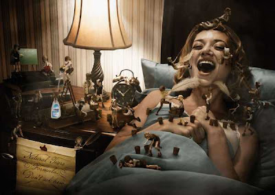
JWT New York: "Bed" print ad for VISINE in USA


When I first saw this ad it reminded me of the visuals I had while reading Gulliver's travels in high school. Hundreds of little tiny citizens of Lilliput were constantly on and around Captain Gulliver, just like this image. I don't know if the creative team of JWT NYC was inspired by this novel from the 1700s or not, but it seems like it. This ad has a lot going on, so it allows the audience to look closer and see something new. I like the tag line - "Natural Tears Formula. Don't Ask How". If you look closely, the woman is crying and the little people are taking her tears with feathers. The tears stream down her face, on to the feathers, in to buckets, over the bed to the desk, and into the bottle. Visually, the way the tears travel across the ad creates a nice sense of movement. Also, the movement leads to the Visine bottle, which gives it emphasis. The Visine bottle is very small, but JWT was apply to make it really stand up for its size. The blue from the sheets and the blue on the Visine bottle are the most bright colors which help to move the viewer's eye from the tear scene to the bottle as well. Also, the green chalkboard in the background help to balance the color ratio in the scene, I thought. All in all, I really liked this ad and how it created movement and had a storyline. I thought it was also nice how the Visine bottle wasn't the biggest or main focal point of the ad, but you still understood what was going on.

Chile Prolam Y&R: "extra strong" print ad for JANO HOT SAUCE


This print ad reminds me of a scene from a 1980s Italian Mafia film. I really like the black and white background with red contrast, it obviously makes the Jano hot sauce the focal point. The mans facial expression look as though he's been shot, which signifies the strength of Jano. The mans brow and eyes are also squinting in reaction to the sauce, which further exemplifies its strength. You can almost picture this happening in slow motion, much like a gun shot scene. The message that I get from this is that you won't know what hit you, because it's so hot!